
Christian Fillies
Consulting & Coaching · Sr. UX/UI Designer · Sr. Front-End Developer
Hamburg, Germany
Minimal · Intuitive · Elegant. Three principles for the work.
For 20+ years I have worked as a designer and a front-end developer — the two disciplines fused, not handed off. Today that feeds directly into consulting and coaching: helping startups and established teams figure out what to build, then making sure it is made well — from design thinking through pixel-perfect prototypes, on to production.
I take on clients' goals as if they were my own. Down-to-earth in approach, relentless about finding the right answer.
I have worked on projects for Oracle, Elaine, Der Feinschmecker, Pixa, IDEO, and more. Work I helped shape has won Webby Awards and IDSA recognition.
Selected clients & collaborators

















Selected work
-
Cocoa
Concept · UI/UX · Front-End Development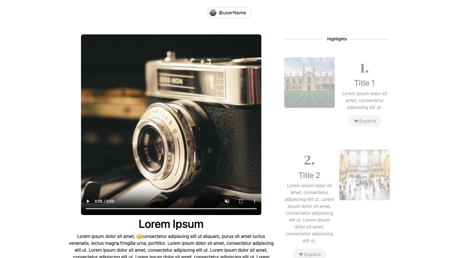
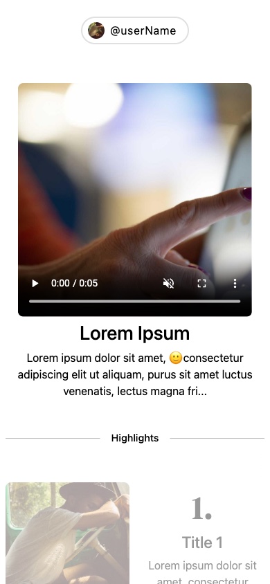
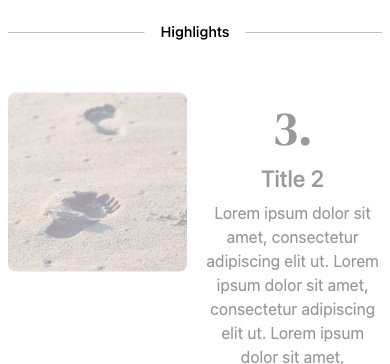
Concept and prototype for a creator-focused startup.
A 2022 contracted design and prototype for Cocoa, a startup in the creator and vlogger space. Worked across iOS and web — visual system, interaction model, and a working prototype on both surfaces. The product is paused for now; further detail is intentionally held back at the team's request.
- Year
- 2022
- Client
- Cocoa
-

Pixelcut Discover
UI/UX · Front-End Development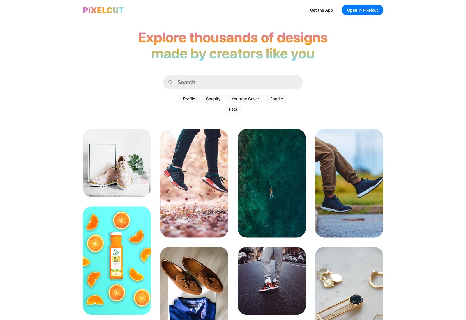
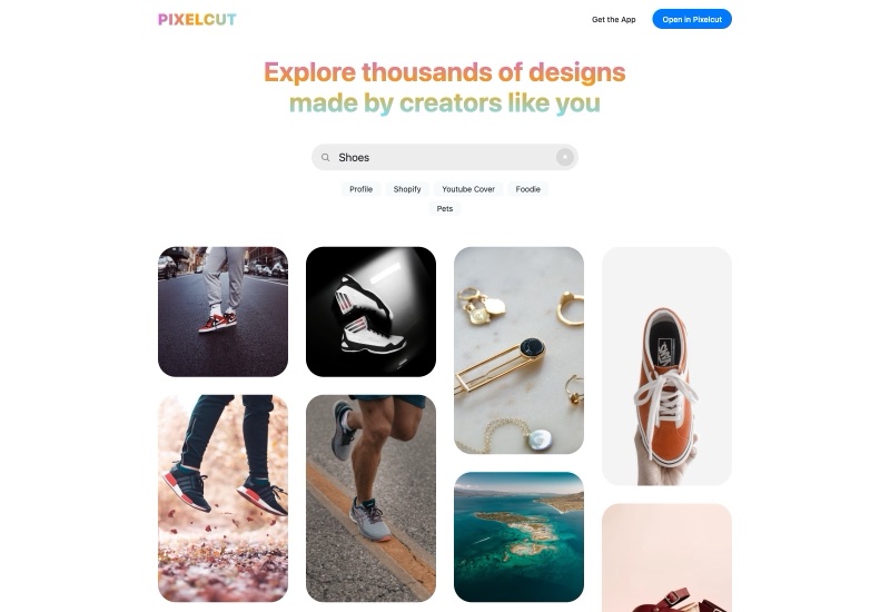
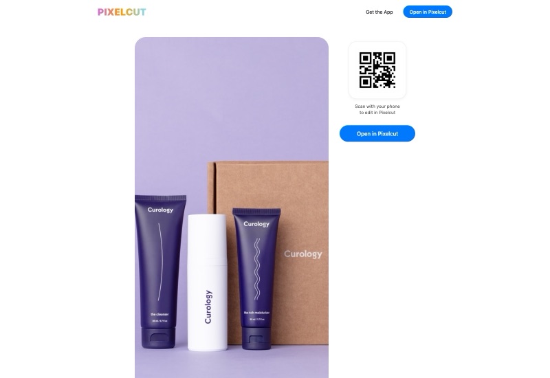
Web home for the templates the Pixelcut community makes inside the iOS app.
A direct freelance engagement with Pixelcut, designed and built end-to-end — concept, visual system, and the production Next.js / React / SASS code. Gradient hero typography, column-count masonry of community-made templates, live search against the Pixelcut API, and a detail view that hands off to the iOS app via QR code: scan, jump, keep editing. The job was to make the catalog SEO-discoverable on the open web while staying a thin doorway back into the mobile editor.
- Year
- 2021
- Client
- Pixelcut, Inc.
-

Cocoon
Front-End Development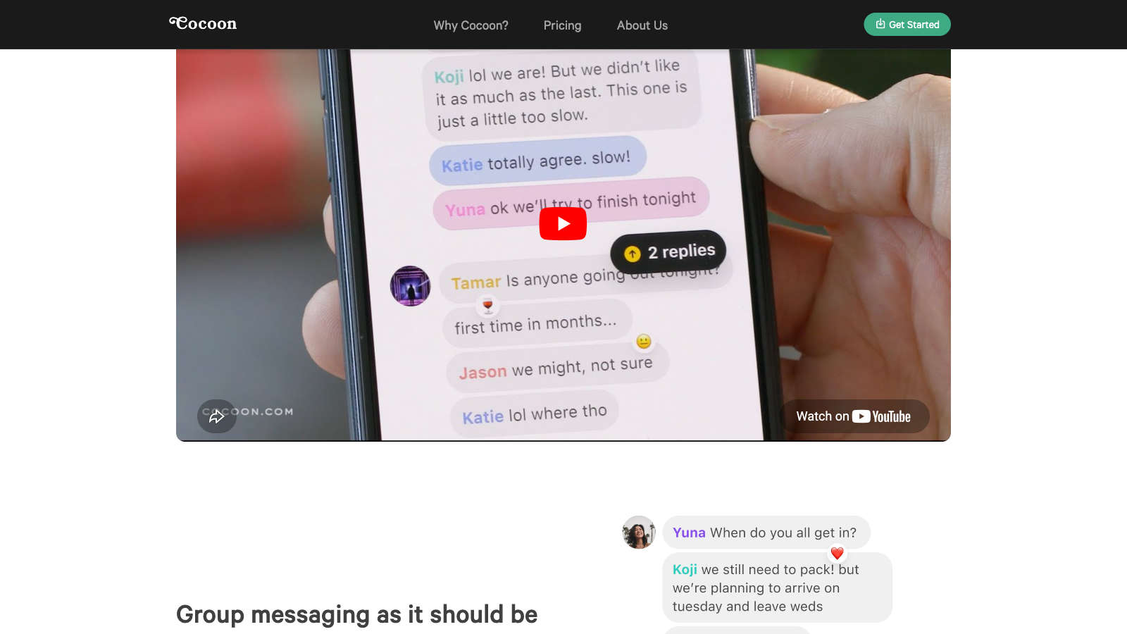

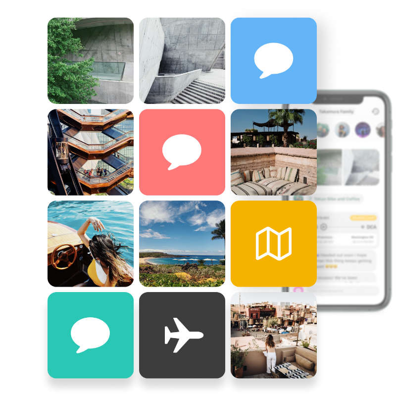
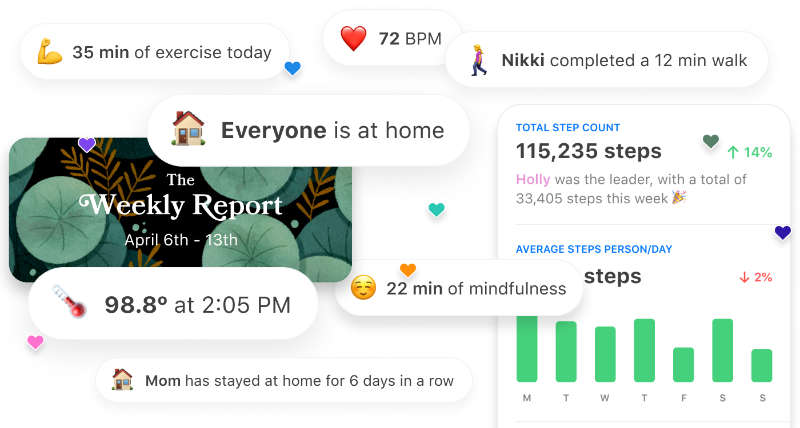
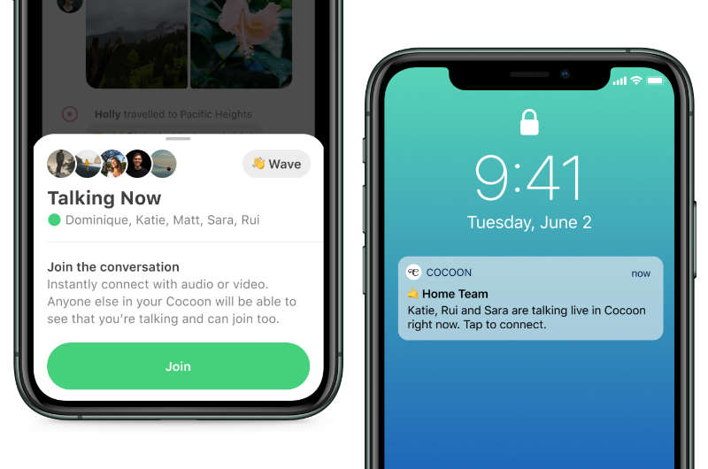
Marketing site for the private messaging app pitched to your closest few.
A freelance front-end engagement with Glasswing, Inc., paired with designer Alex Cornell — he designed, I built. Cocoon was a private messaging app for family-scale groups, pitched against the noise of generic SMS and iMessage, where the people who matter most get buried under verification codes and spam. I built both versions of the marketing site at cocoon.com. The startup didn't pick up — the cocoon.com domain has since been taken over by an unrelated company.
- Year
- 2019–2020
- Client
- Glasswing, Inc.
-

ORACLE Vendor Portal
UI/UX · Front-End Development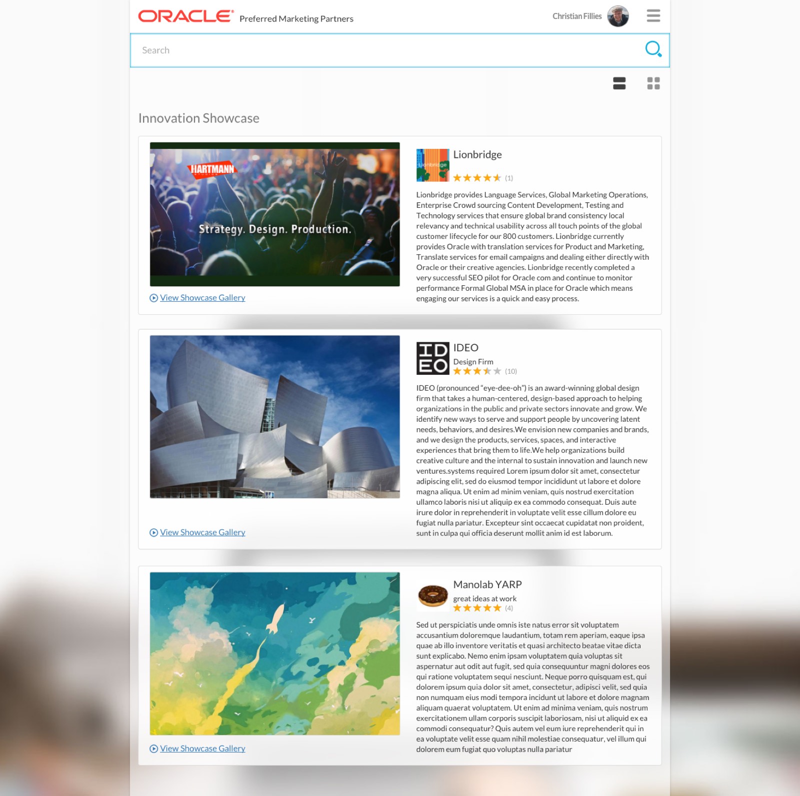
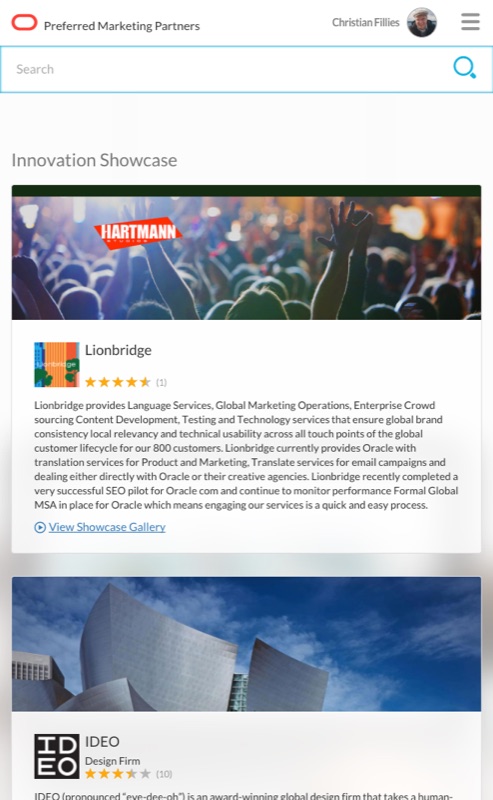
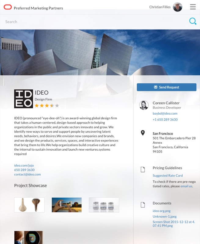
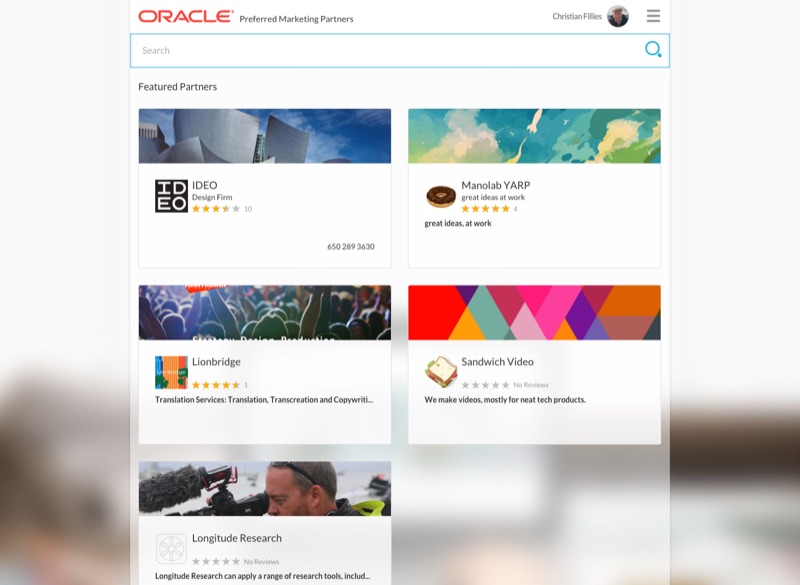
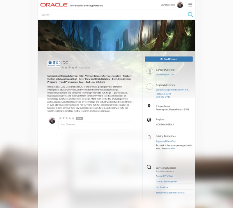
Official internal Preferred Marketing Partners website for Oracle.
Internal Oracle portal that connected the company's marketing teams to its roster of vetted Preferred Marketing Partners — design firms, video studios, research houses, content shops. Partner profile cards with star ratings, contact panels and send-request CTAs, project showcase galleries, and a rotating Innovation Showcase across the top. Designed and built responsive end-to-end so account managers could browse partners from the desk or the road.
oracle.com has since adopted echoes of the portal's design language — the search-led home pattern resembles the interface I built, and the simple "O" I introduced as the wordmark's mobile/app-icon scale-down has become familiar Oracle iconography. The "O" almost didn't survive corporate review — it didn't match the official Oracle CD — but the argument carried: the live site at the time was a convoluted mess of wrong-red hex values, false logo usages, and sub-pages that didn't agree with each other on what "Oracle" looked like. The CD was honored in the breach more than the observance; clearing the floor and rebuilding from one consistent system was the easier defense than patching the old one.
- Year
- 2016
- Client
- Oracle
-

PRINZ Magazin
Concept · UI/UX · Visual Design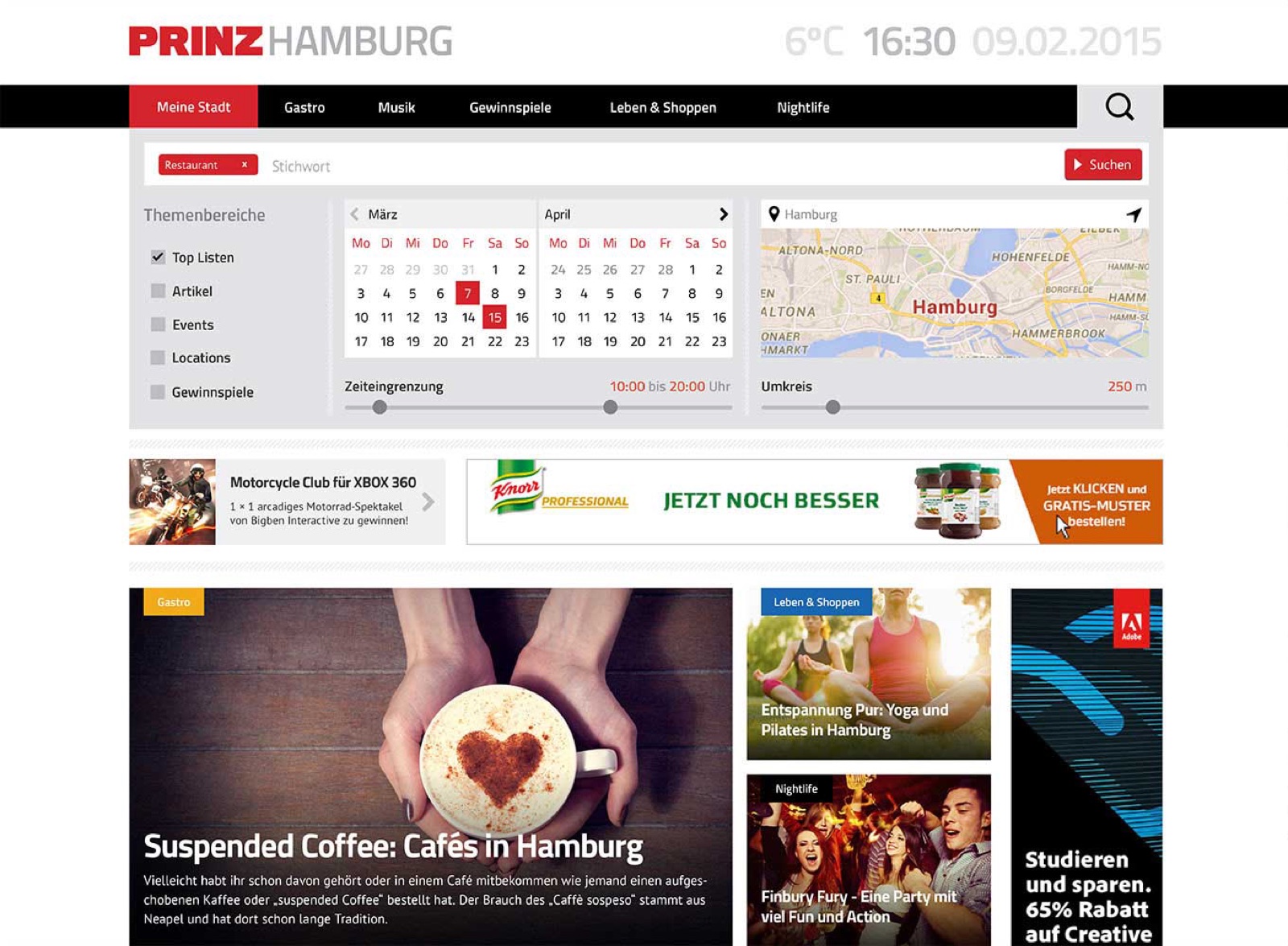
City-portal redesign for PRINZ Magazin — search-first, calendar-driven, location-aware.
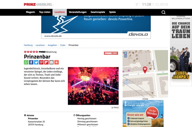
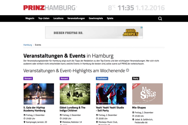
A 2015 concept for the PRINZ.de city portals — PRINZ Magazin ran local editions across many German cities (Hamburg, Berlin, Munich, Cologne and more), and the brief was the shared portal system, shown here with Hamburg as the working example. A search-and-filter hero pairs theme-area toggles (Top Listen, Artikel, Events, Locations, Giveaways) with a two-month calendar and a live map showing the surrounding radius. Below the fold, the editorial layer kept PRINZ's two-column rhythm but tightened the tile system around photography and category chips. The site is still live a decade later — the design has drifted, but the search-first hero, theme-area framing, and the typographic pairing of the PRINZ wordmark with a workmanlike grotesque all trace back to this concept.
- Year
- 2015
- Client
- intosite (Ganske Verlagsgruppe)
-

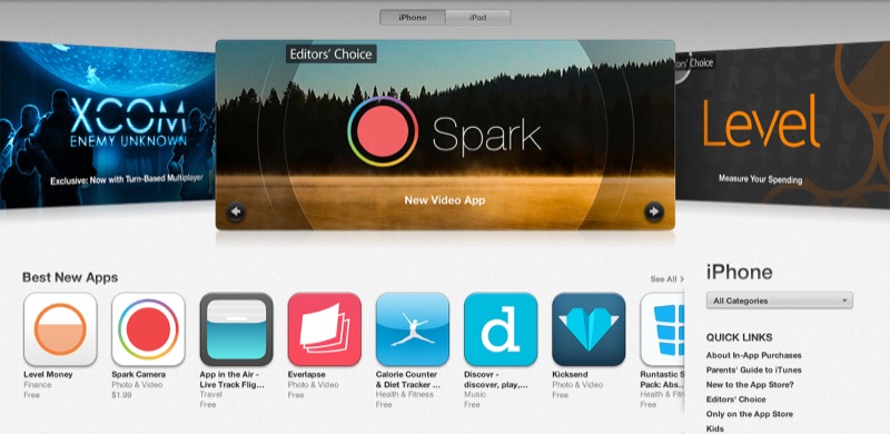
Spark Camera
Concept · UI/UX · Front-End Development · Icon Design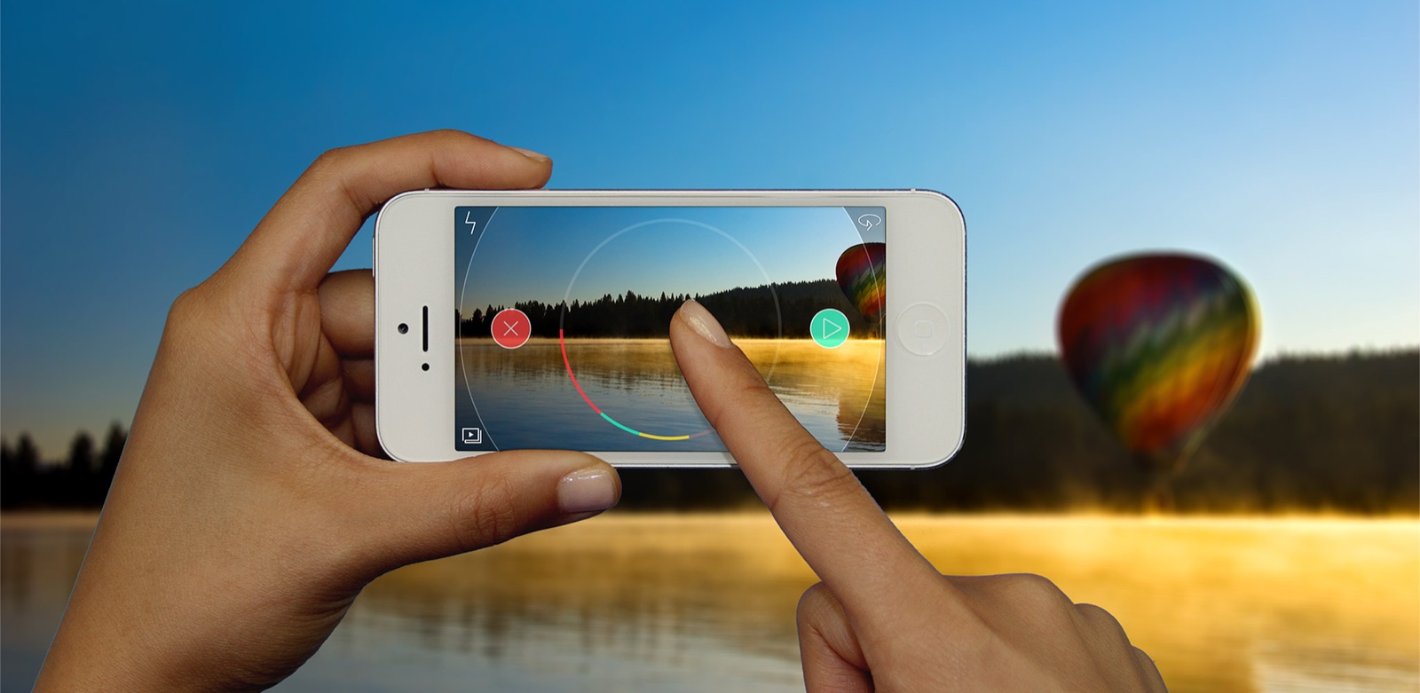
App for shooting and editing short creative videos.
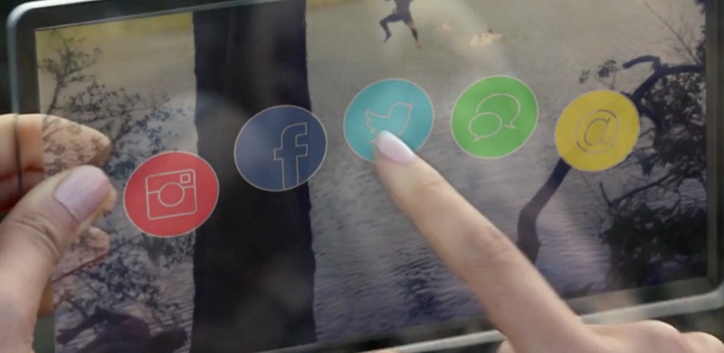
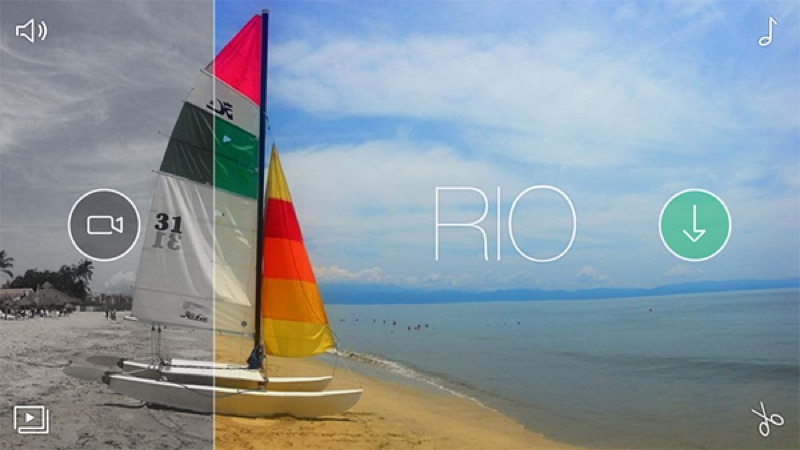
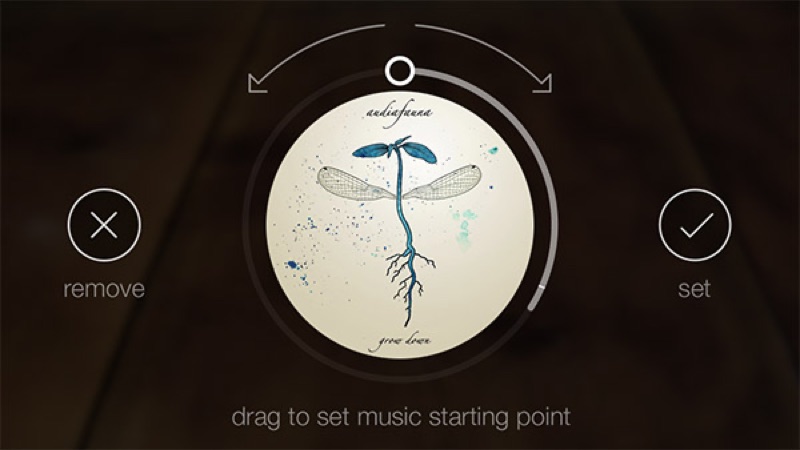
Built with IDEO around a single idea — making a phone-shot video feel like something you would be proud to share. The gesture model leaned on the phone's physicality, not menu chrome: circular dials, drag-to-set music starting point, tap-to-set transitions. Apple featured it as App of the Week and in Best of 2013.
- Year
- 2013
- Client
- IDEO Play Lab · Dayworks, LLC
- URL
- sparkcamera.com
- Recognition
- Apple App of the Week · Apple Best of 2013 · IDSA IDEA award 2014
-

ELAINE Six Campaign Designer
Concept · UI/UX · Front-End Development · Icon Design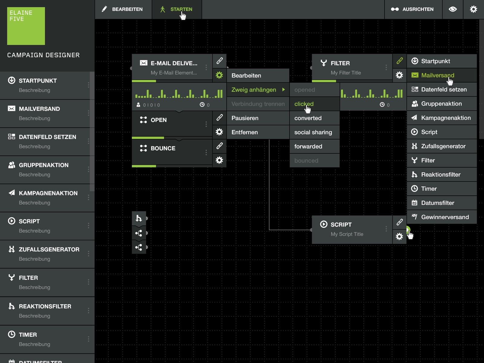
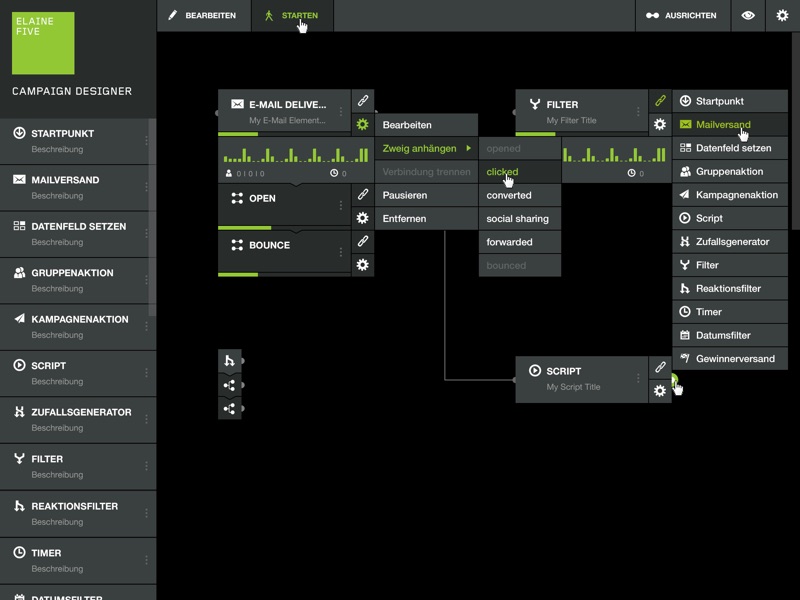
Flow-chart designer for complex email campaigns.
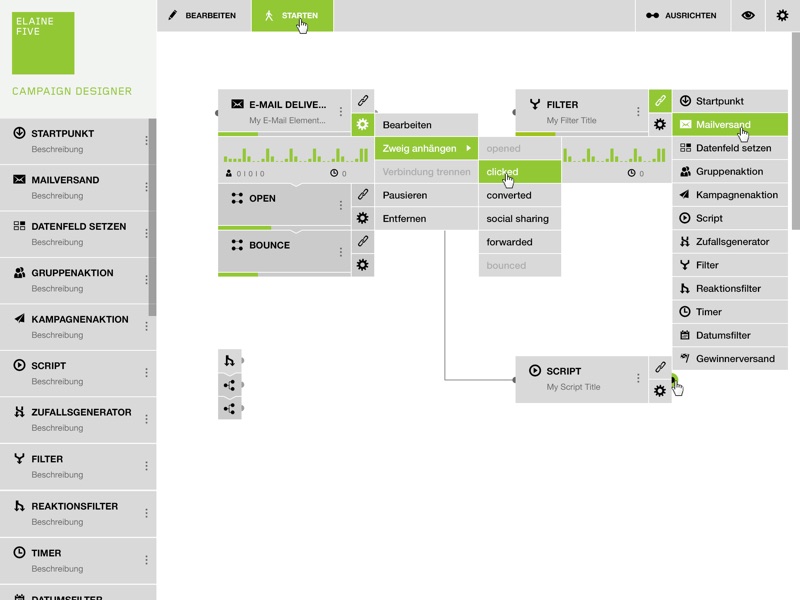
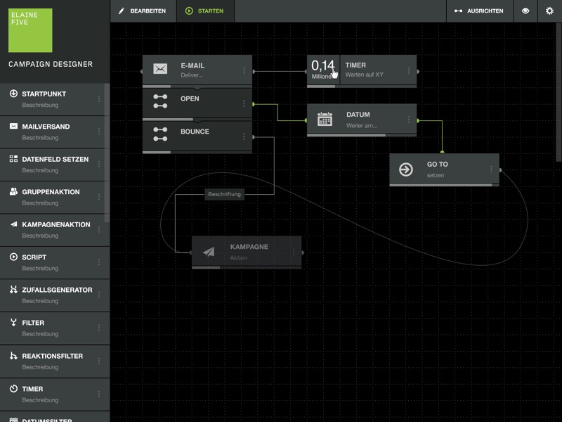
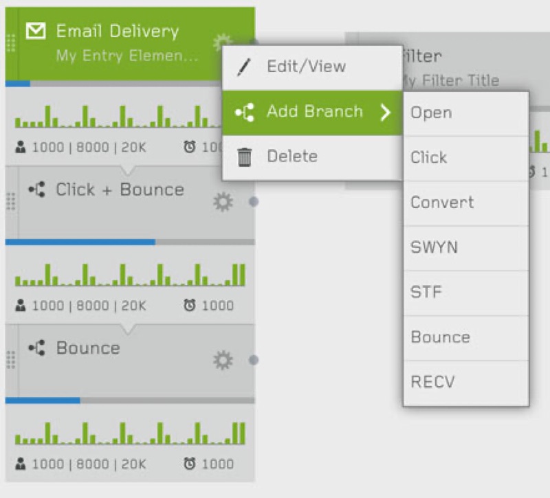
A 2013 redesign of artegic's flagship marketing-automation surface — turning a dense flowchart tool into a draggable dark-canvas editor with heatmap step colouring, hot-path connectors marking the highest-traffic route, an inline statistics view, and a compact left rail of step types. The visual and interaction layer defined here still ships in production today as ELAINE — more than a decade later.
- Year
- 2013
- Client
- artegic AG (now ELAINE technologies GmbH)
- Recognition
- Trusted Solution 2019 (Statista & Computerbild) · still in production after 13+ years
-
Pear
Concept · UI/UX · Front-End Development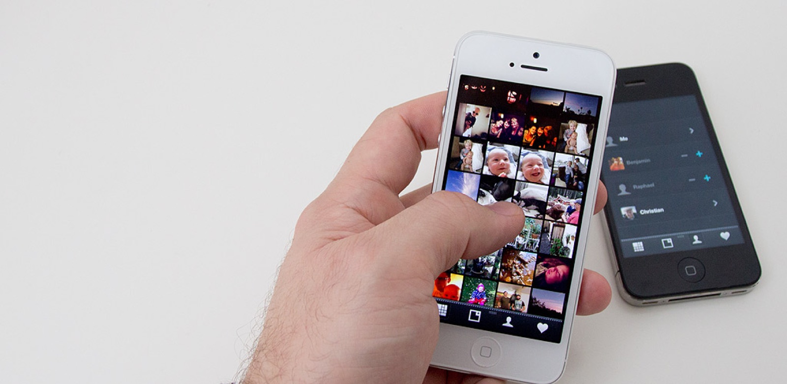
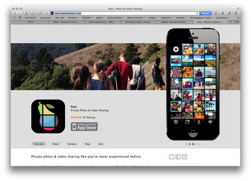
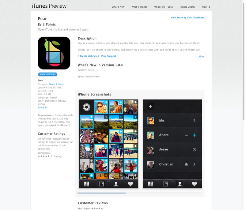
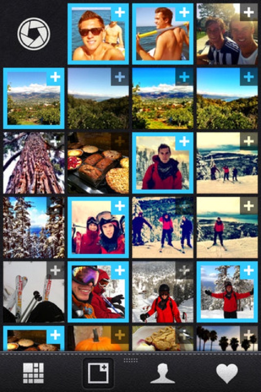
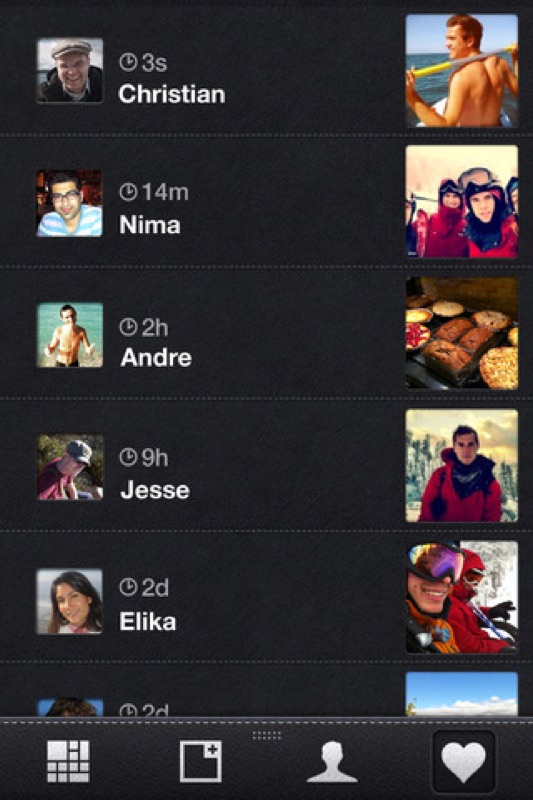
Private photo & video sharing.
A 2012 iOS app and marketing site for Pear — a private photo and video sharing app pitched against the noisy public feeds of the time. Photos already in your gallery get a + button; tap, pick the few people you want to share with, and that’s it. Free in the App Store, iOS 5+, ~6 MB. The app is currently no longer in distribution.
- Year
- 2012
- Client
- Pear (a 3 Points product)
-

Eidamo Webshop
Concept · UI/UX · Visual Design · Corporate Identity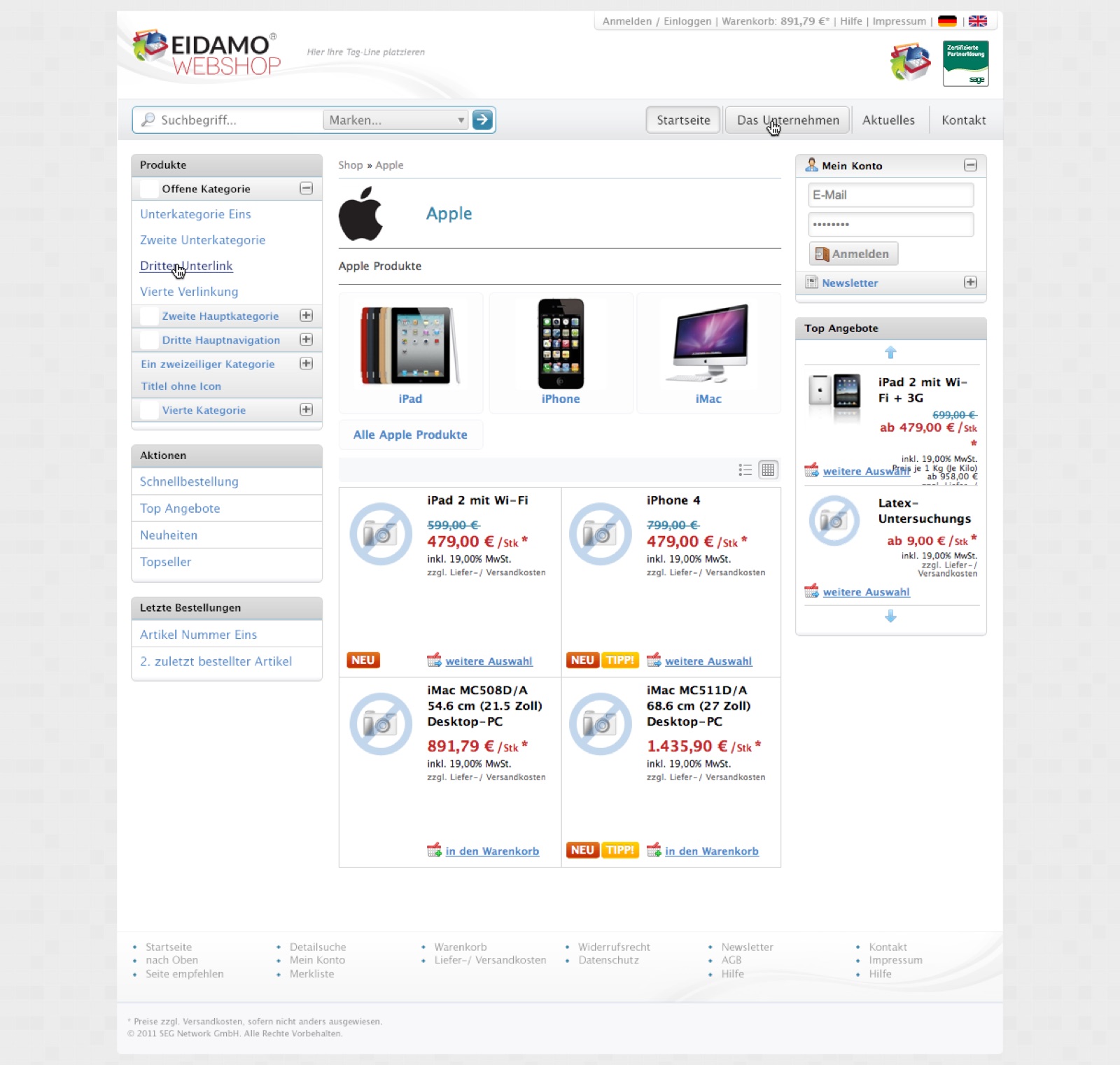
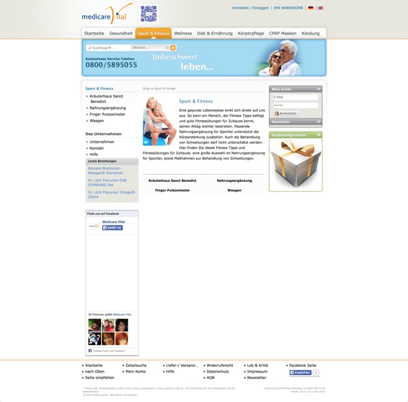
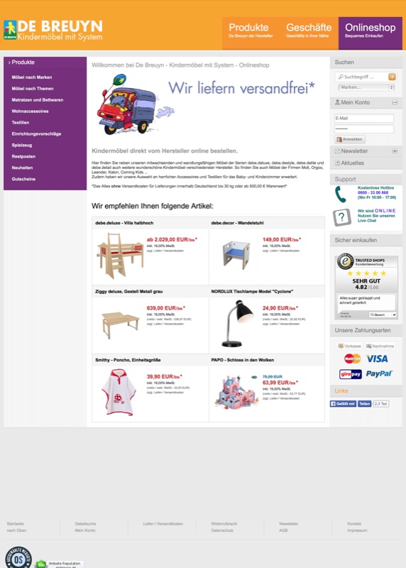
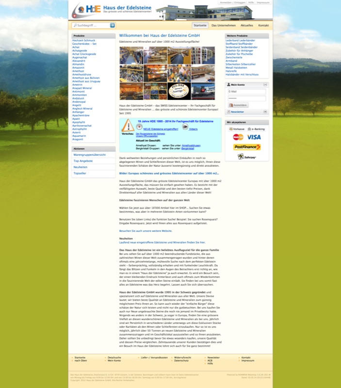
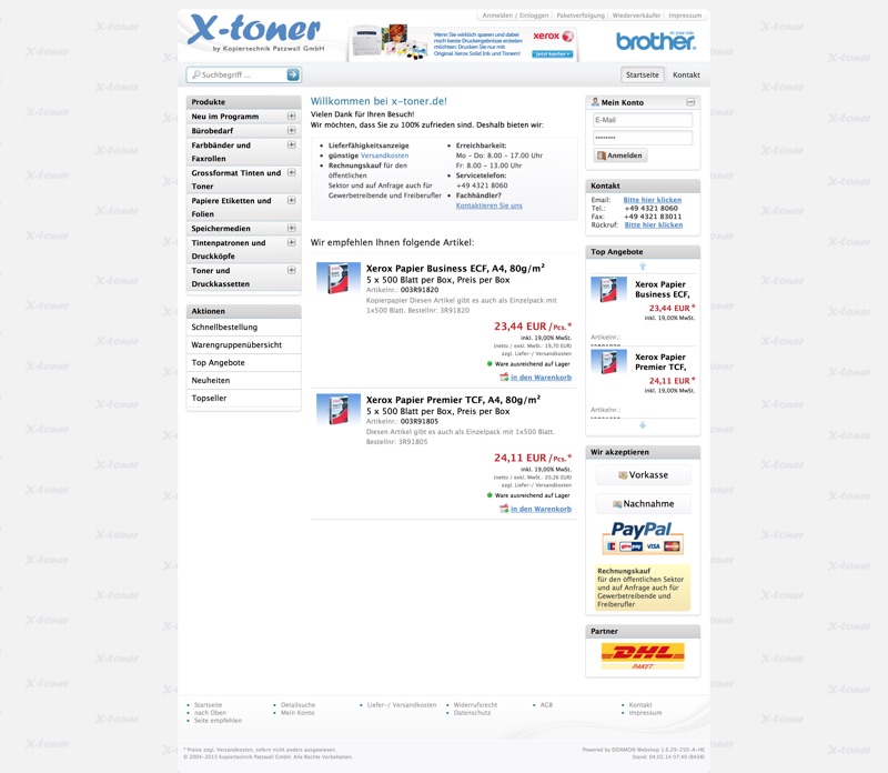
CSS-template-based e-commerce platform running dozens of independent webshops on one engine.
Eidamo was SEG Network's white-label webshop platform — a single template architecture that powered storefronts across very different verticals: pharma supplements (medicare Vital), kids' furniture (De Breuyn), gemstones (Haus der Edelsteine), printer cartridges (X-Toner). Each shop is the same engine wearing a different identity; the design system, navigation patterns, and shopping flow underneath are shared. Worked end-to-end as concept, identity, UI/UX, and the production HTML5/CSS3 template layer over 2010–11. The platform was a CSS-template integration layer for Sage Software ERPs — sales, stock, and orders flowed straight through.
- Year
- 2011
- Client
- SEG Network GmbH
-

Sage MAS 500 Online
Concept · UI/UX · Visual Design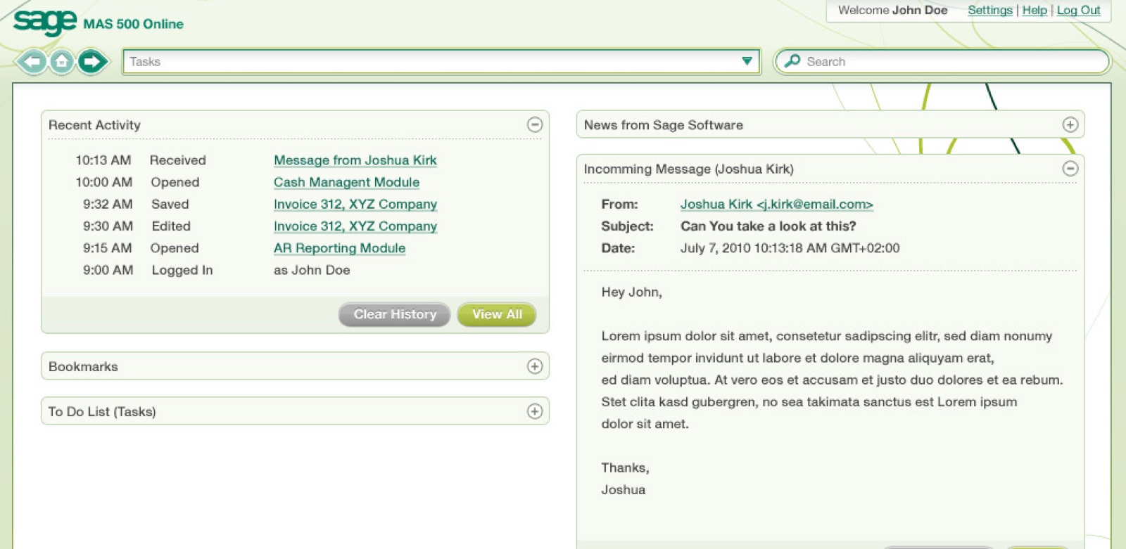
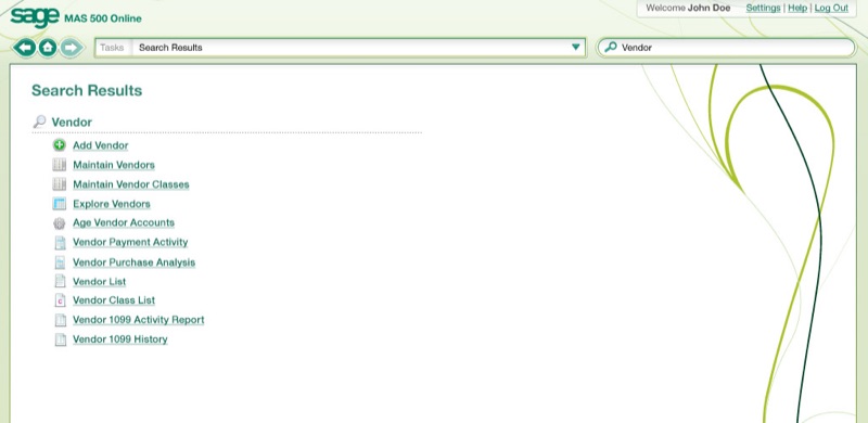
Sage's MAS 500 accounting and ERP system, brought to the browser.
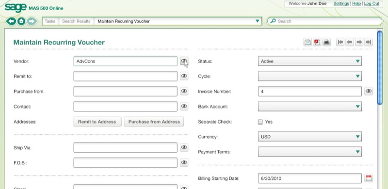
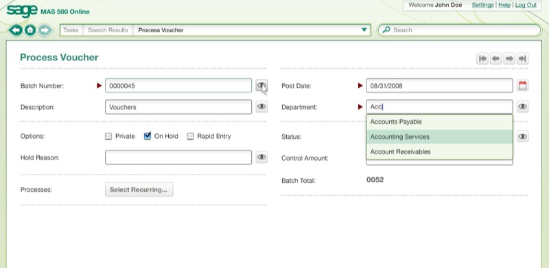
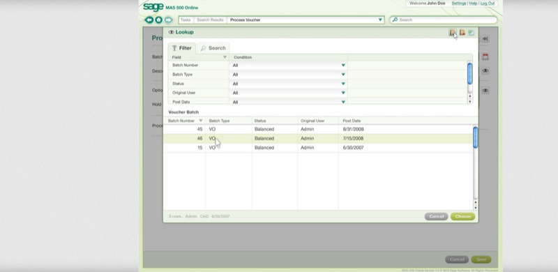
A 2010 concept commissioned by Sage to move MAS 500 — their flagship accounting and ERP product — off the desktop and onto the web. Defined the diamond task-bar with paired Tasks and global Search, the Recent Activity timeline as the dashboard's primary surface, the modeless Lookup overlay for picking records mid-form, and the two-column form grid that kept the data density of a desktop accounting tool while gaining web-native search, autocomplete, and dropdowns. Sage's green wordmark, the muted task-type icon set, and the corporate vine motif curling along the right edge held the brand inside the new form-and-list system.
- Year
- 2010
- Client
- Sage
Personal Fun Projects
-
Cymbal
Turn any song into a live, scrolling drum chart.
Drop in a track — Cymbal splits out the drums with on-device stem separation and turns them into notation you can read, loop, and play along with. Playback from 0.5× to 2×, stem-by-stem mixing, Practice and Stage modes. Apple Silicon; your audio never leaves the device.
-
easy-cookie-consent
Click-to-load consent gate for third-party embeds, plus an optional global modal.
Wraps YouTube, Vimeo, SoundCloud, and Google Maps embeds in a styled placeholder — the iframe URL never enters the document until the visitor clicks. What GDPR's informed consent actually requires, not a banner that loads the embed behind the scenes anyway. Multi-language, single file, ~6 KB minified, zero dependencies.
-
gCal
Render a public Google Calendar into HTML you control — in the browser or at build time.
Clones an HTML
<template>per event and fillsdata-slotattributes with event fields. In the browser that’s ~7 KB with an optional consent gate that pairs with easy-cookie-consent; at build time agcal-syncCLI and reusable GitHub Actions workflow commit a JSON artifact, so the page ships real markup — visible to crawlers and screen readers, no API key in source, nothing to consent to. A calendar edit dispatches the sync directly; a nightly cron catches what editing never touches, like past events ageing out of the window. -
gSheets
Render a published Google Sheet through an HTML
<template>.First row is treated as column headers; every subsequent row becomes a clone of your template, with
data-column-nameslots filled in. Sibling library to gCal — same consent-gate and teardown contract, same template conventions. ~3 KB, zero dependencies, ESM only. -
lazy-video-backgrounds
A sequentially-looping background-video playlist with progressive lazy loading.
Drop a row of
<video>elements into a container — they play one at a time, loop the current clip while the next one buffers, and pause automatically when you scroll away. No framework, no build step, ~1 KB minified. -
weebly-to-firebase
Move a live Weebly site to Firebase Hosting in one command.
Crawls your existing Weebly site, recreates it as a clean Firebase Hosting project, and hands the source back to you — ready to deploy and free to evolve. Zero dependencies; Node built-ins only.